We recently wrote an article with 25 tips graphics and visuals for training materials.
That post was so popular that we thought we’d dig deep again for another article on graphics and learning.
The source for the tips in this article is the book Graphics for Learning: Proven Guidelines for Planning, Designing, and Evaluating Visuals in Training Materials by Dr. Ruth Colvin Clark and Chopeta Lyons.
We hope you like this article, and we recommend you go buy the book, it’s got a million great ideas in it for making better use of graphics and other forms of visuals to improve your training.
- Learning Management Systems
- Online Workforce Training Courses
- Custom Workforce Training
- Incident Management Software
- Mobile Training Apps
Why Use Graphics in Training Materials?
This may seem obvious, but let’s start at the beginning. Why should you use graphics and/or visuals in your training materials at all?
The obvious reason to add graphics to your training–which is the same reason you should always have before you add anything to your training–is they CAN make your training more effective. In fact, a study by Richard Meyer shows that adding RELEVANT graphics to training materials can create an average learning gain of 89% compared to learning materials that are just text (see note 1). So that’s pretty significant and compelling.
But did you notice that word RELEVANT up above? That’s key. Because if a graphic isn’t relevant to the training material, or if it’s inappropriate in some other way, you can kiss that 89% learning gain goodbye. In fact, if you’re not careful, your use of visuals can actually depress learning, meaning they cause people to learn LESS than they would from training materials that are purely text-based.
So what we’ve got here is the classic double-edge sword. Use relevant graphics in an appropriate manner, and you help people learn more. They make training more engaging, they help learners understand, and they aid in supporting memory after training.
But use irrelevant graphics and/or use them in an inappropriate manner, and you’re making it harder for people to learn.
So graphic wisely, my friend!
How to Create Graphics for eLearning: Different Types of Graphics
One way to make sure you’re using a graphic (a) that’s relevant and (b) appropriate for your training goal is to determine what type of graphic it is. Clark and Lyons’ book gives us a list of seven different types of graphics:
- Decorative graphics
- Representational graphics
- Mnemonic graphics
- Organizational graphics
- Relational graphics
- Transformational graphics
- Interpretive graphics
Let’s begin by learning what they mean by each of these different types of visuals.
1. Decorative Graphics
A decorative graphic is a pretty picture, or an image that’s added for purely aesthetic reasons, or one that’s added purely for the sake of humor, or one that’s added because it’s “interesting” or “kinda” related to the training topic but is not directly related to helping the learner satisfy the learning objective(s).
An example that Clark and Lyons give in their book is an image of an airplane being struck by lightning in a lesson about how lightning forms. There’s the lightning connection, sure, but the image doesn’t help anyone understand lightning formation.
Clark and Lyons say that you shouldn’t add graphics merely for decorative purposes. It may seem like it will draw your learner’s attention, and that’s true–but it actually risks drawing their attention away from the material that you want them to learn.
Let’s consider another example, something I saw in real life. It was a clip-art image of a pumpkin placed in the corner of a PowerPoint presentation that was about hot work in industrial facilities. The pumpkin was added because the training session was held right around Halloween. You can see it did nothing to support the learning objective of teaching the hazards of hot work and the rules for performing hot work safely, but you can also imagine that it might have sparked any number of thoughts in the learner’s head related to Halloween.
Although the Clark/Chopeta book addresses this use of decorative images well, perhaps the classic treatment of this is in Richard Mayer’s book Multimedia Learning, so feel free to check that out if you’re curious for more on this.
Because these types of images are discouraged, we don’t have a sample image to share with you here. 🙂
Unless you count that smiley-face emoji.
2. Representational Graphics
A representational image is a “realistic” depiction of a person, place, thing, or symbol.
That doesn’t mean it has to be a photograph or entirely life-like. A simplified line drawing–for example, a line drawing that traces the outline of a bicycle–qualifies as representational in this context.
Below is an example representational graphic. It’s an image of wire rope from our Wire Rope Basics training course.
It’s an accurate representation of wire rope and helps explain to a new worker what wire rope is. It goes one step further than perhaps a photo might be able to do, though, by using animation to show the inner core of the rope and the outer strands.

3. Mnemonic Graphic
Mnemonic graphics are graphics intended to help people remember factual information that would otherwise be hard to remember.
These are related to the old mnemonic devices that we all learned about in elementary school–ROY G. BIV for remembering the colors of the visible spectrum (Red, Orange, Yellow, Green, Blue, Indigo, and Violet), and Did King Phillip Came Over From Germany Swimmingly? as a way to remember the different levels within the biology taxonomy (Domain, Kingdom, Phylum, Class, Order, Family, Genus, and Species). Or, if you learned music, Every Good Boy Does Fine for the notes.
Below is a an example of a mnemonic graphic from our Alert Driving Online Training Course. The image of an oar helps reinforce a three-step method for driving safely–Observe, Anticipate, and React.

4. Organizational Graphics
Organizational graphics show “qualitative” relationships between things.
For example, a graphic organizer in a book that explains the different parts of the book and how they are related together is an organizational graphic. I mention this example in particular because it’s something that Clark and Lyons do very well in the book we’re drawing these ideas from.
Below is an an example of an organizational graphic from a Hot Work Permits online training course.
It’s from an early screen in the course, and the images visually displays for the learner the four hot work job roles that the course will explain. The course returns to this image, highlighting the relevant role, before explaining the responsibilities of each role.
A graphic like this helps to set the scene for a learner and remind the learner throughout the training where he/she is, what’s being discussed, and why it’s being discussed.

5. Relational Graphics
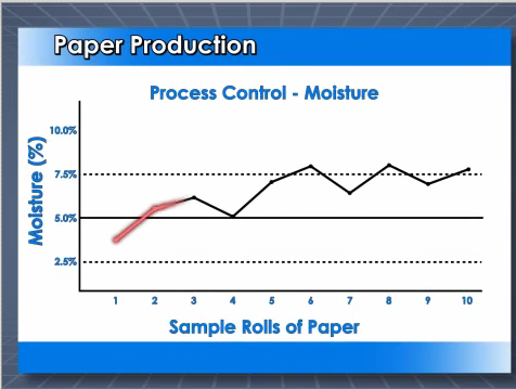
A relational graphic shows “quantitative” relationships.
Examples include pie charts and bar graphs that display numerical trends.
Here’s a relational graphic from an online training course about process control charts. As you can see, the chart shows the relationship between moisture content and different paper rolls.
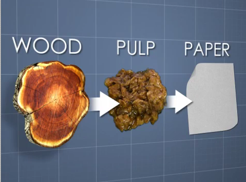
6. Transformational Graphics
Transformational graphics illustrate change or movement through time and/or space.
For example, an image of an infant, a child, a teenager, an adult, and a senior citizen placed along a timeline would be a transformational graphic, because it helps to illustrate the transformation that happens during the human aging process.
Below is a transformational graphic from an online training course about Pulping and Papermaking. The graphic shows the transformation that occurs in the industrial process that converts wood to pulp and eventually to paper. The course, naturally, then explains in more detail how that process happens.
7. Interpretive Graphics
Interpretive graphics illustrate abstract concepts or things that are invisible.
Here’s an interpretive graphic from an online training course about Anhydrous Ammonia (anhydrous ammonia is a chemical used in fertilizers, power plants, and as a refrigerant). The interpretive graphic helps the learner understand the structure and components of the anhydrous ammonia molecule.

Next: Different Types of Training Content and Training Goals/Objectives
Now that we’ve looked at some different kinds of visuals you can use in your training, let’s look at the other side of the coin.
We’ll now consider the type of material you’re trying to help employees learn and remember. The point, as you might have guessed, is that you’ll pick a specific type of training visual to match the type of training material you want the employee to learn.
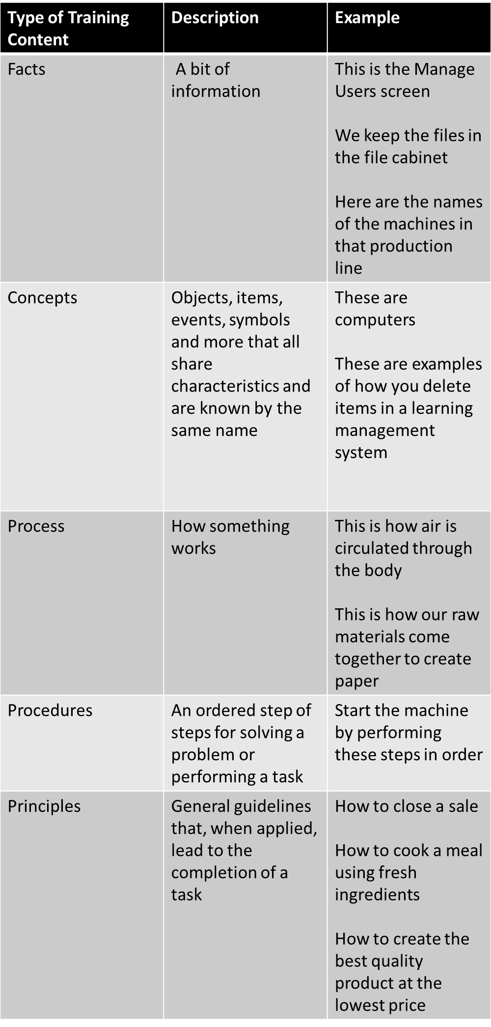
But we’re getting ahead of ourselves. Let’s introduce some different types of training materials and/or different training goals. They are:
- Facts
- Concepts
- Processes
- Procedures
- Principles
Now let’s learn more about each of the types:
I believe this scheme for breaking down training materials into these different types originated with M. David Merrill and his Component Display Theory. Click to read more more about Merrill’s Component Display Theory.
Now that you’ve got the different types of training materials down, let’s see which graphics to use for which type of training material.
Different Training Graphics for Different Types of Training Materials: How to Pick the Right Training Graphic
Now that you know the different types of graphics and the different types of training material, below are some tips for which types of graphics to use for each of the different types of training materials.
1. Facts
Here are Clark’s tips for using graphics to help teach your learners with facts.
Representational graphics work well for facts. For example, a realistic picture of a hammer that’s labeled “hammer.”
Clark has a few other tips for you regarding facts. First, because facts can be hard to remember, try to create a job aid that includes helpful visuals and post that job aid where the worker needs the information. So, instead of a picture of a hammer, a poster in the work area with 20 different tools, each labeled, would be optimal. Also, if you are including a representational image of a fact, Clark suggests including it within its normal work context. For example, a picture of a hammer on the work bench in the work area.
Organizational graphics can also help when creating graphics of facts. For example, in the section above, we suggested putting together a job aid with pictures of 20 tools on a poster. You can apply the benefits of an organizational graphic by putting the tools into some form of two-dimensional table, and by putting hammers and hammer-like tools on the top row and pliers and plier-like tools on the bottom row.
Mnemonic graphics can be a help in cases when you can’t create a job aid like the poster with pictures of tools discussed above. The mnemonic graphic can help the learner commit the fact to memory in a way that makes it easier to retrain the information and retrieve it when it’s needed.
Relational graphics can help explain facts during training when the facts are numerical. For example, a pie chart that shows customers in different industries, or a bar graph that shows increasing injuries over time.
2. Processes
Here are Clark’s tips for using images to help training your employees about processes.
Transformational graphics work well for explaining processes. Think of flow diagrams and charts, with images of the “changing” materials/product at each stage of an industrial process.
Relational graphics can also work well for processes. Here, think of schematic drawings and visual analogies to help explain something abstract, like how a computer system receives data from one system, processes that data, and passes it on to another system.
3. Procedures
Here are Clark’s tips for using images to help training your employees about procedures.
A “blend” of representational and transformational graphics can work well for procedures. For example, if you’re teaching someone to use a software application, use representational screenshots put together to show multiple screens and the changes in those screens throughout the procedure.
Or, to teach someone a specific procedure when working with a machine, use realistic images of the various steps within one graphic that shows the entire “flow” of the procedure.
4. Principles:
And finally, here are Clark’s tips for using images to help training your employees about principles.
Representational graphics that “mirror” the work environment can be effective during training. This is especially true if you’re setting up a computerized training simulation and/or scenario-based learning experience. For example, if you’re teaching clerical staff to perform clerical tasks, a computerized image of a typical office at work with “hot spots” such as the filing cabinet and the computer terminal that they click on at appropriate moments to explain the appropriate work flow would work well.
Interpretive graphics work well for explaining principles–for example, relationships between various described in scientific observations. Clark further notes that there’s “a clear relationship between the amount of time learners spend with visuals and subsequent learning,” and so suggests “to encourage learners to engage with static interpretive visuals, include questions that promote the processing of such visuals, for example, “explain in your own words why….” (see note 2)
Conclusion To Our Different Training Graphics for Different Training Content Blog Post
That’s that–hope you enjoyed it and learned a thing or two.
Many thanks and all credit to Clark and Lyons for writing the book this material is based on. Remember that we encourage you to buy and read it yourself–Clark & Lyons, Graphics for Learning.
And, if you’re interested in stuff about visuals and training materials, don’t forget our earlier blog post with 25 Graphic Design Techniques for Better Training, which is itself based on a different book by Connie Malamed–Visual Language for Designers. This book is also highly recommended. As a further note, we hear that Malamed has just finished another, similar book and think it’s out right now–check that one out too.
If you’re interested in still more about visuals that aid learning, you may also find our article about Scott McCloud’s book Understanding Comics interesting.
Have a great day, and let us know your own thoughts about training and the visuals that make training better (or worse).
How to Write Learning Objectives
All the basics about writing learning objectives for training materials.
NOTES:
1. See Clark/Lyons, More than Just Eye Candy: Graphics for e-Learning, The e-Learning Developer’s Journal, August 11, 2003 (accessed on web here: http://www.clarktraining.com/content/articles/MoreThanEyeCandy_part1.pdf)
2. See Clark/Lyons, Graphics for Learning, p. 319.
What is the ideal size of images on interactive materials? Small or Big please
That’s a difficult question because there’s no single correct answer.
It’s always going to depend on other factors, including whatever else is “going on” within the training.
But to generalize, bigger is better than smaller. Your goal in training is to communicate effectively. One thing you’ve got to do in order to communicate is to make sure your employees can see your visuals. And it’s more likely they’ll see and fully understand a larger graphic than they will a smaller one–especially if there’s a lot of detail, etc.
So more than the bigger/smaller question, I’d say the key question to ask yourself is: “does this graphic effectively communicate what I want my employees to see?”
Hope that helps.