
Looking for something you can do to create more effective learning experiences for your workers? Experiences in which the workers really learn and then transfer that learning to the workplace? We all are, right?
One of the easiest things you can do to help your workers learn is to create better training visuals that are well-conceived and designed. In fact, research shows that you can use better training visuals to dramatically increase your learner’s comprehension, retention, and transfer of behaviors to the workplace—and that’s especially true for “novice” learners who are new to a particular content area.
Want to know why this is true? Want to learn some techniques to help you learn how to design great training materials? Sure you do! Just keep reading (and looking at the example visuals, of course) to learn more. We’ve got some great graphic design tips for elearning for you below–for any type of training, really.
- Learning Management Systems
- Online Workforce Training Courses
- Incident Management Software
- Mobile Training Apps
Why Do I Need Graphic Design Tips for eLearning (or other training)?
Well, let’s look at some reasons.
Better Training Visuals Improve Learning
So, first things first. Why is learning increased when the training materials include relevant visuals?
According to the well-accepted Dual Coding Theory, originally proposed by Allan Paivio, the brain has two separate systems for processing information. There’s one system for processing language (sometimes called the “verbal” system) and a second system for processing visual images. The brain can process information from both incoming “streams” at once, and the two streams of information work to support one another.
Well-designed training materials include information in both formats—language and visuals. And this leads to great training materials.
Do ALL Visuals Make Training Materials More Effective?
Although adding visuals to your training materials CAN increase their effectiveness, that doesn’t mean they ALWAYS do. For example, there are at least four cases in which adding visuals can decrease the effectiveness of the training. These are:
- Adding a completely unrelated visual for purely decorate purposes—for example, adding a clip-art picture of a smiling sun in the corner of a PowerPoint presentation about hazard communication.
- Adding a marginally related visual that does not directly support the learning objectives but seems “interesting”—for example, adding an image of a diamond wedding ring to training materials designed to teach proper mining techniques.
- Adding so many images that the learner’s working memory is overloaded, or adding visuals that otherwise detract from the learning experience—for more on this, see the Cognitive Theory of Multimedia Learning by Richard Mayer.
- Redundantly creating materials for both of the brain’s processing systems (see above) that compete with one another for the brain’s limited processing power—again, see the Cognitive Theory of Multimedia Learning by Richard Mayer for more on this.
So, it pays to know something about visuals and how they affect learning. And we’ll present some ideas on that below.
Here They Are: Create Better Training Materials with these Graphic Design Tips for eLearning
Now that you know that visuals can improve your training materials, wouldn’t it be great if you had some more helpful tips for creating those visuals? Well, that’s exactly what we’ve got for you—25 specific graphic techniques that you can use when creating your visuals for maximum training power.
The techniques listed below are drawn from the excellent book Visual Language for Designers by Connie Malamed.
We thank Malamed for the work she put into her book and we encourage you to read it cover to cover yourself (buy a copy here). You can also check out her blog, the eLearning Coach, for lots more great stuff from her.
But what are those graphic design techniques, you ask? We’ll cover all 25 shortly, but you’ll see that they fit into the following six categories:
- Organizing visuals so the viewer will quickly and easily perceive the important elements–Use features that “pop out,” different textures to draw attention, and group items within the visual
- Directing the viewer’s attention to the most important elements–Position elements within the visual, emphasize elements, make use of movement (or the appearance of movement), direct the eyes of the viewer, and provide visual cues
- Using simplified visuals as that are easier to process mentally–Reduce visual noise, use silhouetted figures, make use of icons, incorporate line art, and let a single item represent larger numbers of the same item
- Making abstract or obscure concepts easier to understand–Present the big-picture view, create easy-to-understand visualizations of data or other forms of information, use maps, and design visuals that include time as an element
- Making complex, complicated information easier to understand–Present information visually in segments and/or sequences, use special views the human eye can’t normally see, and use the structure of a graphic to help reinforce the graphic’s intended meaning
- Using emotions, storytelling, surprise, and humor to increase attention and learning–Add emotional elements to visuals, use visual storytelling techniques, create visual metaphors, and incorporate unexpected and/or humorous elements
Still curious? If so, read on, because we’ve provided 25 explanations and examples of graphic design techniques you can use to design great training materials. As mentioned earlier, the ideas are drawn from the book by Connie Malamed. The visual examples are drawn from training courses created by Convergence Training.
First Tip: Make it Easy to Find the Important Parts of the Visual
One way designers can use visuals to increase the effectiveness of training materials is to organize and present the different items on-screen in a way that makes it easier for the viewer to recognize and “pull out” the desired information. Three techniques for doing that are using features that “pop out,” using textures to separate items, and grouping items.
Use Features that Pop Out
Visual elements that “pop out” grab our brain’s conscious attention. Items on-screen may pop out for a number of reasons, including their size, color, shape, orientation on-screen, and more. For example, in the image below taken from a course on preventing back injuries, the yellow highlight on the spinal column makes it pop out from the rest of the image. This effectively draws the viewer’s attention to the spine as the audio narration speaks about the spine.

Image taken from course: Back Injury Prevention
Course library: Health and Safety
Now let’s look at a second example taken from a course on crane and hoist rigging. This image of the “sling angle” used in rigging uses a highlight to draw the viewer’s attention to the angle created by the sling—and that’s what the audio narration is talking about at the same time.

Image taken from course: Crane and Hoist Rigging Safety
Course library: Equipment Safety
Use Textures
One of the first things our brain does to group the items in a visual into related units is to analyze the visual texture. Designers can use texture to guide the viewer to recognize and focus on important items on-screen, to separate the foreground and the background, and to provide a sense of depth.
For example, consider the image below, taken from a course on crane, hoists, and rigging. It uses three different textures to effectively represent the blank background, the core at the center of the wire rope, and the strands that surround that core. That makes it easy for the viewer to focus their attention as the audio discusses the different parts of the wire rope.

Image taken from course: Wire Rope Basics
Course library: Operations & Maintenance
Or, in this example, taken from a course on slips, trips, and falls, texture helps to draw the viewer’s attention to the cracked and uneven surface of the broken concrete, which presents a tripping hazard.
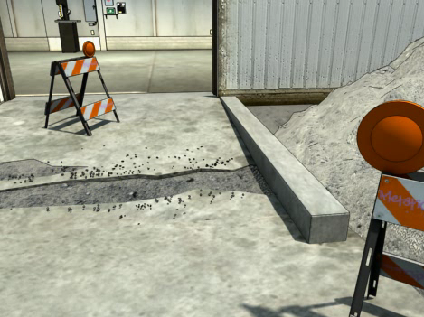
Image taken from course: Slips, Trips, and Falls
Course library: Health and Safety
Group Items
One effective tip is to arrange items on-screen in ways that suggest they are associated with one another. Designers can do this by placing items near one another in space-or next to one another in time if it’s a video. They can also do this by representing items with the same or similar shapes and textures, or by arranging items to form a symmetrical figure. Likewise, items that don’t have these elements in common tend to look unrelated to one another.
For example, this image of the “pictograms” required by OSHA’s new Hazard Communication 2012 standard clearly suggests that the eight images on-screen, represented in similar shapes and textures and arranged to form a symmetrical shape, are all associated.
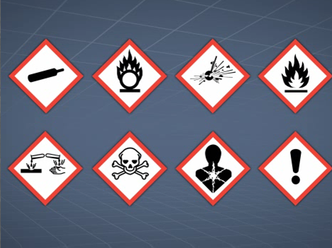
Image taken from course: Hazard Communication 2012 (GHS Alignment)
Course library: Hazardous Materials
In our second example, taken from a course on trenching and excavation safety, the arrows are grouped on-screen and colored to draw the viewer’s attention and to illustrate a point. The grouped red arrows on either side of the trench represent the gravitational force that could lead to a cave-in, while the grouped green arrows represent the shoring used to prevent a cave-in.
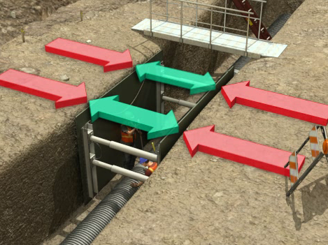
Image taken from course: Trenching and Excavation Safety
Course library: Health and Safety
Let’s review. We just covered three ways how to design great training materials with elements that immediately grab your workers’ pre-conscious attention. They are:
- Creating elements that “pop”
- Using texture
- Grouping items
These techniques make it easier for your learners to quickly focus their attention and draw out meaning when they first glance at a visual. Using them in your training materials will help your learners understand and remember more.
Second Tip: Direct the Learner’s Eyes and Attention
Another way visuals designers can effectively use visuals in training materials is to direct the viewer’s eyes to the important parts of the screen or, as Malamed says in her book, “through the structure of the graphic.” Five ways to do that are to use position, emphasis, movement, eye gaze, and visual cues. We’ll look at each below.
Position Items within the Visual For a Reason
A designer can use the boundaries of the visual to create a “frame,” and then place visual elements within that frame in a manner that guides the learner’s eyes through a path or sequence and/or gives hints about what is the most important element on-screen.
For example, consider the image below from a course that explains how to perform a job hazards analysis. It takes advantage of the eye’s natural tendency to read from top to bottom and left to right to create a “visual hierarchy” of information. In the top left, we learn we’re analyzing the “What?” of the JHA’s four-step “Where?/What?/How?/Consequences” sequence, and as our eyes scan to the right, we see that the sharp blade is an example of the “What?” that defines the hazard.
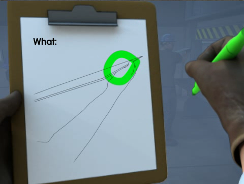
Image taken from course: Job Hazards Analysis (JHA)
Course library: Health and Safety
Now let’s look at a second example, taken from a course on ergonomics. The worker’s spine is located directly in the center of the image, making it easy for the learner to focus on the risks of working in awkward postures.
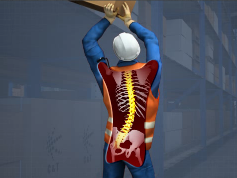
Image taken from course: Ergonomics for Industrial Environments
Course library: Safety and Health
Emphasize Items
Another way to direct the viewer’s attention is by using emphasis. Malamed notes that the artist can do this by varying size, tone, color, texture, shape, and more.
For example, the image below, taken from a course about emergency action plans, uses the contrasting colors of yellow and green to emphasize the importance of knowing the best way to evacuate your work area in the event of an emergency.
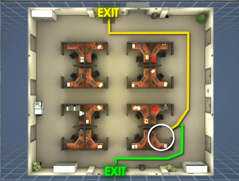
Image taken from course: Emergency Action Plans
Course library: Safety and Health
Or, in this example, taken from a course on fall prevention and protection, the red color of the scaffolding creates contrast with the blue background of the glass building, immediately directing the learner’s eyes and attention to the scaffold and its position “at height.”
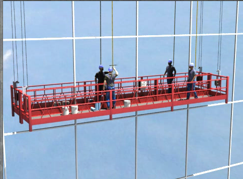
Image taken from course: Fall Prevention and Protection
Course library: Safety and Health
Add a Sense of Movement
Yet another way to direct the viewer’s attention is through the use of “movement” in the image. This doesn’t necessarily mean you have to use animation (though that can be useful), but that the image conveys a sense of movement. This can be done with repetition, lines, curves, three-dimensional depth, and other techniques.
For example, the arrows in the image below effectively explain the motion of the parts within a pump and the motion of the fluid through the line and the pump itself.

Image taken from course: Pump Basics
Course library: Operations and Maintenance
The image below, which explains the “lay” of a wire rope, doesn’t show active motion but does show the related concept of direction. The image is from a course explaining wire ropes, in particular from a discussion about the lay of a rope. Wire rope can have a right lay, in which the strands are wrapped to the right around a central core, or it can have a left lay, in which the strands are wrapped to the left. The arrow in the image effectively communicates the direction of the wrap, and therefore the rope’s “lay.”
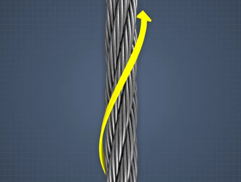
Image taken from course: Wire Rope
Course library: Equipment Safety
The same concept can be used to show a process. For example, the image below, taken from a course on chemical process safety management, arranges the different elements in a job process within a straight line to help demonstrate their sequence within the process and the concept of a process in general.

Image taken from course: Process Safety Management (PSM)
Course library: Hazardous Materials
And our final example, taken from a course on line breaking, the use of three-dimensional representation is one of the techniques used draw attention to the pipe in the foreground. (Pop quiz—how many other techniques can you notice in this one image?)
Image taken from course: Line Breaking Safety
Course library: Health and Safety
Use “Onscreen Eyes” to Direct the Eyes of the Learner
Another trick of the trade is to use eyes within the image to direct the attention of the viewer’s eyes. Specifically, a designer can draw attention directly to an eye (or eyes) within the image, or direct attention in the direction that a person within the image is looking.
For example, this image from a course on first aid at the work place uses the man’s eyes to direct the viewer’s attention to his hand, where an amputation injury has occurred. You probably noticed this same technique in the line-breaking graphic during the pop quiz just above, no?
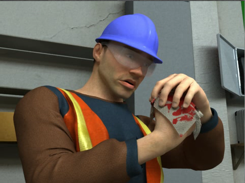
Image taken from course: First Aid for Common Injuries
Course library: First Aid
Or, in this example, taken from a course on fire safety, the man’s eyes help to direct our attention to the fire extinguisher on the wall.
Image taken from course: Fire Safety
Course library: Safety and Health
Add Visual “Cues” to Direct the Viewer’s Attention
A final method for directing the viewer’s eyes—and their attention—is to use visual cues. These cues can include arrows, color, highlights, captions. For example, this image from a course on valves uses a line, color, and caption to help explain which part of a valve is the bonnet.

Image taken from course: Valve Performance
Course library: Operations and Maintenance
Or, in this example, taken from a course that explains how doctor blades work in the process of making paper, the yellow lines below draw the viewer’s attention to the angle between a large drum and the doctor blade (this angle affects the amount that the paper coming off the drum is “crumpled,” more correctly known as creping).
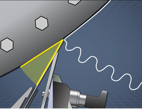
Image taken from course: Yankee Dryer Creping Basics
Course library: Pulp, Paper, Tissue, and Corrugated Board
There you have it. Five ways to direct the viewer’s attention to the most important elements of a visual. They were:
- Using position
- Using emphasis
- Incorporating movement
- Directing the eye gas of the viewer
- Adding visual cues
Training visuals that use these techniques really boost the end result—changing your workers’ on-the-job behaviors.
Third Tip: Use Simplified Visuals to Ease Comprehension
In her book, Malamed discusses the importance of simplifying images in order to increase comprehension and retention. Simpler visuals allow the viewer to scan them more quickly, move the information into long-term memory more readily, and reduce the chances of overloading the viewer’s short-term (or working) memory, which can store only very few bits of information at any one time. Malamed also notes that simplified graphics are especially useful for learners who are new to a topic, whereas people who are more familiar may benefit more from visuals with higher degrees of realism.
Some ways to simplify an image are reducing or removing visual noise, using silhouettes, using icon forms, using line art, and limiting the number of objects in a visual. We’ll look at each below.
Remove Distracting Visual Noise–or Rather, Don’t Add it
Visual noise is the collection of details within the image that may make it appear more realistic but can also distract the viewer’s eyes and attention from the really important information. Reducing visual noise within an image makes it easier for the viewer to focus on the essential stuff.
For example, this image is from a course on conveyors and appears during an explanation of different types of conveyors. As the audio discusses roller conveyors, with materials rolling on top of the conveyor’s belt, everything in the visual disappears except for the conveyor belt and the item on top. This makes it easier for the viewer to immediately focus on the key concept, and doesn’t distract the viewer with other parts of the conveyor or with a potentially busy and distracting factory scene in the background.
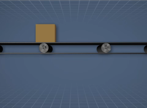
Image taken from course: Conveyor Safety
Course library: Equipment Safety
Or, consider the example below, taken from a course on crane safety. The audio is discussing the importance of inspecting the hooks before they are used. So, the visual displays just the hook, and the crane and the industrial setting are removed from view.

Image taken from course: Crane and Hoist Rigging Safety
Course library: Equipment Safety
Use Silhouettes of People or Objects
Another way to reduce the realism of an image is to make use of silhouettes. Artists can use silhouettes to represent things using merely their shape. Using a silhouette to represent a person or an object can help your viewer quickly identify the object and understand what it is. In addition, in some cases a silhouetted object can represent all objects of that type—for example, a silhouette of a man may represent all men, and a silhouette of a woman may represent all women.
Consider the image below, taken from a course on machine guarding. The audio is discussing the importance of using machine guarding to prevent common injuries, such as the crushing of a body part. The silhouetted human figure, machine gears, and mangled arm convey this hazard effectively.

Image taken from course: Machine Guarding
Course library: Equipment Safety
Want another example? We need look no further than the same course on machine guarding and its list of common machine-related injuries. This time, the blackened silhouettes make the risk of amputation immediately apparent.

Image taken from course: Machine Guarding
Course library: Equipment Safety
Use Icons
Icons are simplified, stylized representations of real-world objects or ideas. Unlike a silhouette, which uses only shape, icons may use shape, line, and color. Like silhouettes, however, they allow the viewer to quickly identify the object and move the information into long-term memory.
For example, the visual below is drawn from a course on process control charts. The audio is discussing the importance of product consistency. The large, red X quickly conveys to the viewer that this product is not consistent with productions standards.

Image taken from course: Process Control Charts
Course library: Operations and Maintenance
Another example appears only seconds later in the same course. This time, a green check mark indicates a product that is consistent with production standards.

Image taken from course: Process Control Charts
Course library: Operations and Maintenance
Make Use of Line Art
Line art uses simple lines to represent the outline of a person or item. And like silhouettes and icons, line art can make it easier to quickly identify an object and process the key information. Malamed also mentions that line art can be especially useful for technical drawings that explain the inner workings of the body or a machine.
Below is a good example from a course on the evaporators used in the papermaking process. As the audio discusses three different common evaporator designs, line drawings of each are presented, making it easy for the viewer.
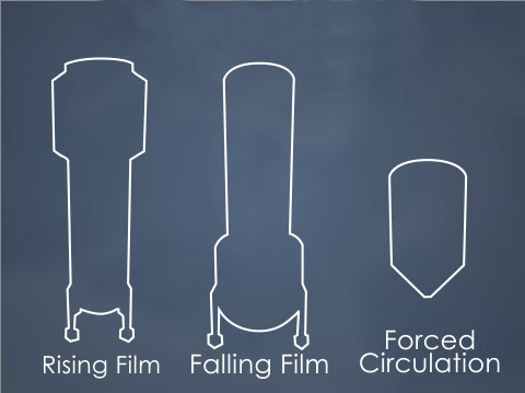
Image taken from course: Black Liquor Evaporators-Introduction
Course library: Pulp, Paper, Tissue, and Corrugated Board
Our second example below is taken from a course on tanker rollovers. While discussing the importance of checking road and traffic conditions along a route before setting out, the visual uses simple line drawings to represents roads (note: this also makes use of the convention of mapping, which will be discussed later in this article).
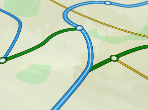
Image taken from course: Tanker Rollover
Course library: Driver Safety
Reduce the Number of Things in the Visual
Malamed’s final tip for simplifying visuals is to reduce the number of objects in the visual. This may mean removing unrelated items, a technique we’ve already seen several times in earlier examples of other techniques. Or it may mean using one or two items to represent many more.
For example, check out the image below from a course on cranes. During a discussion of crane rigging and slings, the audio discusses different types of rigging devices. While discussing spreader beams, the image below appears. Everything else you’d see in a photo of a spreader beams on a real crane in an industrial work area has been removed, making it easy to recognize what a spreader beam is. In addition, this one image of a spreader beam represents all spreader beams (for those of you who studied philosophy in college, this isn’t so far from the idea of the “Platonic idea” of a chair—see, you DID finally get to use that in real life!).

Image taken from course: Overhead Crane Basics
Course library: Equipment Operation Safety
Finally, consider the image below. It’s taken from a course that explains a somewhat-complicated part of the papermaking process. As the audio explains what happens to many wood chips surrounded by cooking liquor within a Kamyr digester, a visual call-out displays a single wood chip that represents all of the chips in the column (note: the call-out technique is something we’ll revisit in a later in this article).

Image taken from course: Continuous Cooking Introduction
Course library: Pulp, Paper, Tissue, and Corrugated Board
And that wraps up another one of our sections. As you’ve seen, you can simplify your visuals and improve the learning experience for your employees by using visuals that:
- Reduce visual noise
- Use silhouettes
- Use icons
- Use line arts
- Reduce the number of objects in the visual
Fourth Tip: Make Abstract and Obscure Concepts Easier to Grasp
The world is full of abstract, difficult concepts—and we can use visuals to make them easier to understand. I bet you’ve done this on a whiteboard yourself many times. Malamed explains that this type of visual goes by many names, including abstract, non-representational, logical, and arbitrary graphics. But no matter what you call them, the artist is visually representing abstract ideas and concepts so they’re more concrete and therefore easier for the learner to understand.
These techniques are used to represent ideas or relationships. They draw much of their explanatory power by representing ideas symbolically or by representing relationships through the visual space of the image, and they greatly aid the viewer by reducing complexity to a more simplified, readily apparent form. Some ways to do this include providing the “big-picture” view, displaying data in visual form such as graphs and charts, creating visual displays of information, using maps and standard mapping conventions, and representing time visually. We’ll look at each below.
Show the Big-Picture View
One way to make a complex, multi-staged process or concept more readily apparent is to display a simplified version of it in a “big-picture” visual. These visuals make use of cyclical representations, arrows, global presentations, and visual hierarchies of information that give more importance to items at the top and left. They allow the viewer to process the information at the larger, more universal level, and then to drill down into the smaller elements once they’re ready for more.
For example, the image below is from a course on evaporators. It gives the big-picture view of how an air conditioning systems works and how its smaller components each play a role.
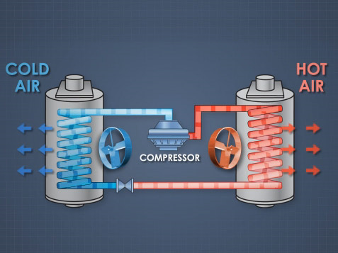
Image taken from course: HVAC-Heating and Cooling
Course library: Operations and Maintenance
The image below is another example. It presents a high-level overview of a somewhat-complicated, multi-step kraft pulping process used when making paper. This allows the learner to see all the different stages in the process, the different machines involved, and the order of operations.
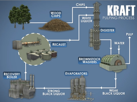
Image taken from course: Kraft Pulping Liquor Chemistry
Course library: Pulp, Paper, Tissue, and Corrugated Board
Show Data in Charts, Graphs, and More
Visual displays of data are some of the most commonly used abstract graphics, and we all see them every day in news stories, technical publications, and elsewhere. They include L-shaped graphs with an x- and y-axis, bar charts, pie charts, pictograms, statistical maps, area graphs, and more. All of these displays make great use of the spatial aspects of the visual to convey meaning. And they’re effective ways to communicate efficiently, since nearly everyone is already familiar with the rules for interpreting these common graphic displays.
For example, the graph below shows the “flow characteristic” of a valve, plotted as the percent of total flow through the valve against the distance the valve stem travels as it opens and closes. In a quick glance, the learner can note the general convex-shaped curve to determine that this particular valve is a quick-open valve (as opposed to a straight line, which would indicate a linear flow valve, or a convex curve, which would represent an equal percentage flow valve).
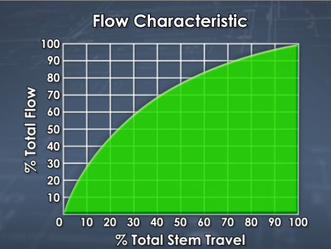
Image taken from course: Valve Performance
Course library: Operations and Maintenance
For a second example, consider the graph below, which plots humidity and temperature to identify different heat indexes and uses colors to identify the most dangerous combinations (of course, the artist is making use of another visual convention in choosing green, yellow, and red to quickly communicate safe, caution, and danger/risk).
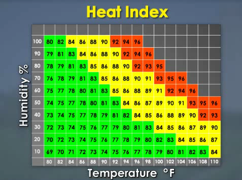
Image taken from course: Heat Stress Basics
Course library: Safety and Health
Present Information in Other Visual Forms (Not Charts and Graphs This Time)
There are many highly inventive, clever, and unique methods used to visualize large sets of data and/or complex ideas. An example you’ve probably seen is a “word cloud” that shows you the words used on a given web page and how frequently each word appears (the words that are used more frequently are larger than the words used less frequently). These “information visualizations” are less formulaic and more diverse than data displays, which tend to take the form of standard things like pie charts, L-shaped graphs, and pictograms, so it’s harder to give a simple explanation of what they are.
For example, Malamed’s book includes a beautiful and fascinating image created by Stefanie Posavez of the United Kingdom that looks like a flower but is in fact a representation of the various chapters, paragraphs, sentences, and words in Jack Kerouac’s novel “On the Road,” with the words color-coded to represent major themes. (This is really worth checking out in the book—I posted a picture of it onto my Facebook page and friends got really excited about it–or you can check out Stefanie Posavez’s website.)
Or, if you’d like to check some other examples, here’s a few I saw recently while reading a news story about the “movement” of western culture over the last 2,000 years.
In the example below, from a course on the H1N1 flu virus, we see a still image taken from a demonstration of how many Americans die as a result of flu each year, with each falling red cube representing a fatality (remember that this image, like all images in this post, is a still image captured from an animated video that plays out over time). The fatalities caused by the flu are compared to the number of fatalities caused by other things we may worry about more than the flu, such as bear attacks (represented by yellow blocks, so few they’ve already been covered by the falling red blocks), shark attacks (green blocks, also now covered and hidden), and airplane crashes (blue blocks, with a few still visible). The overall effect is to quickly demonstrate to the viewer how few people die of bear attacks, shark attacks, and airplane crashes, and how deadly the flu truly is.

Image taken from course: H1N1 Flu Awareness
Course library: Safety and Health
A second example is the image below, from a course on heat stress. It’s an explanation of how being overweight can contribute to the risk of suffering heat stroke. The pulsing red zone within the person’s body is a quick and easy way to visualize an elevated internal body temperature and an increased risk of heat stroke (note the use of other techniques we’ve already discussed, such as silhouetting and reducing visual noise).

Image taken from course: Heat Stress Causes
Course library: Course library: Safety and Health
Use Maps and Mapping Conventions
Another technique is the use of maps and mapping conventions to quickly convey information. Maps, like the graphs we’ve already discussed, are created using a set of conventions that most of us have already learned to read and interpret, making them a handy way to convey information. They’re abstract displays of information because they don’t (and can’t) include all information; instead they include only the information that’s most important to the map’s intended purpose.
For example, consider the difference between a standard road map and a map that includes a state-by-state breakdown of American voting habits. The map below is from the H1N1 flu virus course discussed earlier. The global map with multiple red ‘blotches’ was intended to simply demonstrate the global reach of the pandemic.

Image taken from course: H1N1 Flu Awareness
Course library: Safety and Health
To consider another example, the map below from a course on corrugated board (lay people like you and me call this “cardboard”) gives a quick, easy-to-digest summary of the locations of corrugated plants in the Americas. Want a quick demonstration of how powerful this technique is? Just imagine how much more difficult it would be to quickly get the sense of the same information displayed in words and numbers within a table.

Image taken from course: Corrugated Board Basics
Course library: Pulp, Paper, Tissue, and Corrugated Board
Use Representations of Time
The final technique to discuss in this section is the visual representation of time. The classic example, and the one we’re all probably most familiar with, is the timeline, but there are other representations as well, and you often see time represented implicitly in visuals that explain sequences.
Let’s look at a timeline first. The image below is taken from a timeline that discusses key events in the history of papermaking (again, this is a still image taken from an animated video, so the image has been scrolling along the timeline from left to right). At this point in the video, we learn that in recent years there has been a greater emphasis on using recycled fibers to make paper.
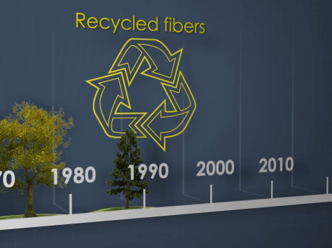
Image taken from course: Pulping and Papermaking Overview
Course library: Pulp, Paper, Tissue, and Corrugated Board
By contrast, the image below is a more implicit representation of time. It’s a description of a feedback control loop used to regulate a process. The viewer can see that material flows through a valve and then flows under the sensor (the curved arrows within the pipe represent flow direction and imply time). The viewer can also see that the sensor then sends a message to the controller, and that the controller then adjusts the valve accordingly (here, the pointed arrows that create a dotted line represent the direction of information flow and imply time).
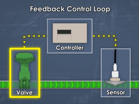
Image taken from course: Valve Performance
Course library: Operations and Maintenance
And that wraps up this section, in which we listed techniques that can help make abstract ideas and concepts more easily understood. The techniques included:
- Providing a big-picture view
- Displaying data in charts, tables, and graphs
- Presenting information in more unique visualizations
- Using maps
- Using representations of time
All of these techniques help to clear the fog and allow the viewer to zero in on the essential meaning of abstract topics.
Fifth Tip: Clarify Complexity
You may think it’s good, or you may think it’s bad, but we all know it’s true: a lot of things in the world are complex and complicated. But that doesn’t mean people don’t have to learn about and understand them.
Learning designers can help ease that process by using visuals that present complexities in a way that makes them easier to understand. In some cases, it may be possible to simplify the complexity and focus in on only the essential core information. But in other cases, the visual will have to be somewhat complex as well. When a complex visual is required to help convey complex information, this places greater demands on the viewer and may overwhelm their capacity to take in information.
To prevent this, and increase the chances that they’ll learn the required information, designers can use a number of different visual techniques. These include presenting information in step-by-step sequences and/or in “chunk-sized” segments, using special views that the human eye can’t see or a photograph can’t capture, and taking advantage of the structure of the visual itself to either reinforce the meaning or to aid perception.
When using any of the three techniques, Malamed points out that the visual should be coherent and should provide context. Coherent means it should make sense—providing both the cause and effect, for example. And context means it should provide the information necessary for the viewer to understand—showing the full building and then using an insert to focus on a smaller detail, for example. With the introduction down, let’s consider each of the three techniques.
Present Information in Steps and/or Sequences
In some cases, a complex operation, process, or procedure can be present in a step-by-step manner. That’s a sequence. And in other cases, complex information can be presented in small “chunks” within a single visual, with each chunk walking the viewer through smaller bits of information, perhaps in a “learn this bit, which lets you understand this next bit” order.
For example, the image below shows a three-step process for lifting safely (it’s based on a NIOSH poster). In some cases, of course, the procedure will be more complicated than lifting a box, but you get the idea.
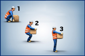
Image taken from course: Back Injury Prevention
Course library: Health and Safety
In discussing sequencing, Malamed’s book gives a great example of a single graphic that explains Einstein’s Theory of Special Relativity. It presents different “chunks” of information, beginning with a scene-setting introduction, then presenting his famous “twin paradox,” moving on to a discussion of relative motion based on the viewer’s perspective, next comparing and contrasting Newtonian and Einsteinian concepts of time, then presenting the E=mc2 theory, and finally explaining the immense energy created when a small uranium-236 atom is split. That’s a lot of information, but it’s all presented in small, bit-sized chunks that help explain the “big picture” of Special Relativity. That’s another reason to pony up the money to buy Malamed’s book and read it in its entirety.
Make Use of “Special” Views the Eye Can’t See
The human eye is amazing, but there are things it can’t see. Learning designers, though, can side-step that problem by using visuals that side-step the limitations of ordinary site. Techniques include using interior views, cutaways, x-ray views, exploded views, magnified views, and views that imply motion within a still image.
Again, let’s look at some examples. Interior views let the viewer see an “inside” view they otherwise couldn’t see. The example below shows the smaller components within a machine. These would ordinarily be invisible, and seeing them this way would make it easier for an employee to understand how a machine works.

Image taken from course: Centrifugal Cleaners
Course library: Pulp, Paper, Tissue, and Corrugated Board
Or, to consider a similar but slightly different idea, the cutaway below is an effective way to label different parts of a device used to store flammable liquids, both outside (the lid and spout cover) and inside (the flame arrester).
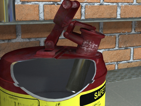
Image taken from course: Flammable and Combustible Liquids
Course library: Hazardous Materials
Yet another similar visual technique is the X-ray view. The graphic below highlights the strain put on a person’s spine when lifting objects in awkward positions.

Image taken from course: Ergonomics for the Industrial Settings
Course library: Health and Safety
Magnification is a way to show things that we ordinarily can’t see because they’re too small. For example, the image below shows the tiny fibers that join together to form paper.

Image taken from course: Wet End Chemistry Basics
Course library: Pulp, Paper, Tissue, and Corrugated Board
Below is another example of magnification. This example, taken from a course on preventing tanker rollovers, shows the ‘big picture’ view to set the scene and an insert to show a magnified detail of the critical information. This visual convention, which designers use and most people already recognize and understand, is one of the ways that designers “set the context” within an image, as mentioned earlier.
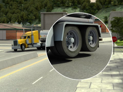
Image taken from course: Tanker Rollover
Course library: Driver Safety
Exploded views—in which the smaller parts that make up a whole are separated and perhaps labeled, allowing the viewer to more easily recognize each—are another special view. The image below is an example of this, explaining the different parts of a roll of paper as delivered by a paper mill.

Image taken from course: Roll Handling and Wrapping
Course library: Pulp, Paper, Tissue, and Corrugated Board
Create Structural Elements that Reinforce the Visual’s Informational Content
The last of the techniques from this section that we’ll discuss has to do with the structure of the image itself. In Malamed’s book, she gives two examples that are worth calling out here.
The first is a museum exhibit that presents biological evolution, with the silhouetted profiles of different organisms appearing on the familiar double helix that is the shape of DNA. The double helix helps to immediately set the scene for the viewer—they know the exhibit will be about genetics.
The second example in the book is a graphic that explains the “structure” of a wetland. From top to bottom, the visuals shows the sky, the surface, sub-surface water, subsurface rocks that hold the water, and finally roots. The top-to-bottom visual presentation mirrors the top-to-bottom arrangement in the real world, and helps orient the viewer.
Another way that a designer can take advantage of the structure of the image to aid the learner is to present the information in a way that makes it easier to compare and contrast different items or concepts. For example, the image below presents two visual explanations of two different ways manufactured goods can be loaded into a rail car—hot loaded or floor loaded. By placing one visual explanation directly above other, the designer makes it easy for the viewer to compare and contrast the two and zero in on the differences.
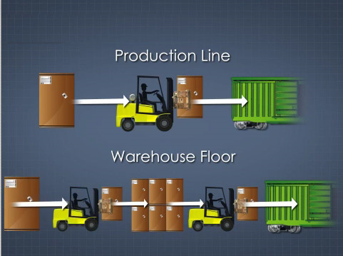
Image taken from course: Railcar Loading–Paper Rolls
Course library: Pulp, Paper, Tissue, and Corrugated Board
And finally, in the image below, the designer presents different “approach zones” in a course about arc flash. By presenting the zones in a horizontal, left-to-right orientation, the designer creates a mirror between the visual and the real-life distances these colored zones represent.
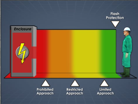
Image taken from course: Arc Flash Safety
Course library: Safety and Health
Using the approaches just described will help you present complicated material in a way that your employees will find easier to understand, which of course makes it more likely that you’ll see the change in behavior you want at the work place. As a reminder, the tips we just covered included:
- Presenting information in step-by-step sequences
- Presenting information in small “chunk-size” segments
- Using special views the eye can’t see and photos can’t capture
- Creating visuals with structures that reinforce the concept
Use these tips to help your workers digest complexity and to avoid overloading their working memory.
Sixth Tip: Use Emotions, Storytelling, Metaphors, Surprise, and Humor
Research into cognition and common sense both tell us that there are some things that draw people’s attention and help us to remember. That’s what this final episode is all about—things that add a spark of interest to training because our brains crave them and/or things that cause information to “imprint” in our long-term memory more effectively. In particular, we’ll look at four different graphic techniques. These include visuals that:
- Appeal to our emotions
- Involve aspects of storytelling and narratives
- Make use of visual metaphors
- Are unexpected and/or humorous
Let’s get the show on the road, shall we?
Appeal to the Viewer’s Emotions
Our brains react quickly and strongly when emotions are involved. People tend to focus their attention on emotional aspects, they tend to prefer emotional content over neutral content, and the additional emotional spark seems to play a role in increasing memory. Artists can introduce emotional elements in many ways. A simple way is through the use of color.
For example, the red highlight on the machine below quickly communicates danger.

Image taken from course: Equipment Maintenance and Reliability
Course library: Operations and Maintenance
The image of a pedestrian near a forklift below makes use of that same color-coded emotional message to illustrate the hazards of pedestrians near mobile machinery.
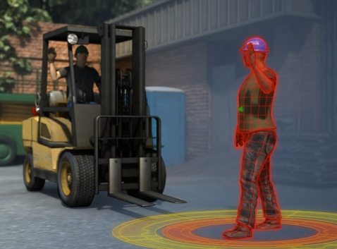
Image taken from course: Forklift Safety
Course library: Equipment Safety
Yet another way to appeal to emotions is to show something we all share an emotional response to—like the tornado in a dark, forbidding sky below.

Image taken from course: Emergency Action Plans
Course library: Health and Safety
You can also appeal to emotions by showing a person in danger. For example, the man falling from a forklift below grabs your attention through his dangerous position and the expression on his face.
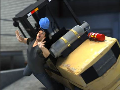
Image taken from course: Forklift Safety
Course library: Equipment Safety
And, more subtly, the woman’s expression below helps demonstrate the hazards of stress at the workplace.

Image taken from course: Stress Management and Prevention
Course library: Human Resources
A quick note about emotional appeals: While this technique can work, don’t overdo it. It’s probably easy enough to understand that if the visuals are enough to really get the viewers emotions riled up, they’re likely to be distracting and to detract from your training effectiveness. So in this case, remember the advice from the great sages about the value of moderation, and save discussions of hot-button issues like religion and politics for dinners with the extended family. 🙂
Use Storytelling and Narrative Techniques
In ancient times of yore, people gathered around fires and listened to stories about Gilgamesh, Beowulf, El Cid, Achilles, Odysseus, Aeneas, Roland, and others. Today, we spend millions gathering in darkened movie theaters to watch similar stories (or we watch Breaking Bad and Mad Men on Netflix—but you get the point).
Why? Because people like stories and we remember them. Plain and simple.
So it certainly pays off to take advantage of this and include stories and storytelling techniques in your training materials. That can mean threading fascinating scenario-based learning into your courses, sure, and we encourage you to do that (watch for an upcoming blog series about this). But it can also include simpler things, such as representations of sequences and processes.
For example, the image below represents all the complexity of the papermaking process and illustrates it in three simple steps—make the sheet of paper on a paper machine, roll it on a winder, and produce packaged sheets on a pallet for shipping. Pretty nice for an overview, perhaps as part of an introduction.
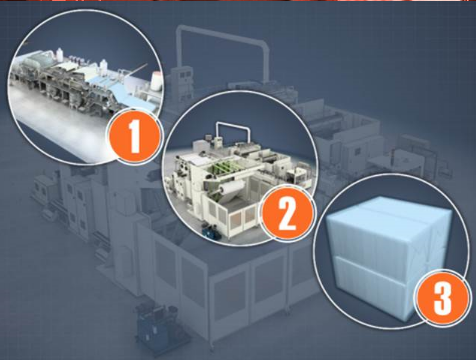
Image taken from course: Introduction to Paper and Board Machines
Course library: Pulp, Paper, Tissue, and Corrugated Board
Or, to tell a more detailed version of the same story, the graphic below is more appropriate. This might be nice to include as a still frame, allowing the learner to review at his or her own pace.
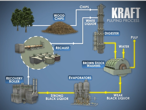
Image taken from course: Continuous Cooking Introduction
Course library: Pulp, Paper, Tissue, and Corrugated Board
Use Visual Metaphors
We probably all make use of analogies when explaining something to another person during a conversation. Visual designers can make use of visual analogies to help explain things as well. For example, the image below helps to illustrate the different amounts of “drag” on particles of different shapes as they fall and settle through a substance by representing the particles as skydivers. The larger the surface area, represented by the width of the arc, the more drag.

Image taken from course: Green Liquor Clarifiers
Course library: Pulp, Paper, Tissue, and Corrugated Board
Or, consider the image below, taken from a course on forklift safety. The artist makes use of a see-saw to explain the balance of forces between the forklift’s counterweight and the weight on the forks. This takes an unfamiliar and perhaps hidden aspect of forklifts and puts it into a context most people are familiar with and understand easily.

Image taken from course: Forklift Safety
Course library: Equipment Safety
And in the image below, taken from the same forklift safety course, the stability of a forklift is represented visually as a yellow pendulum within a green “stability triangle.” Just keep the weight, represented by the yellow pendulum, centered within the green triangle and the forklift is stable and safe.
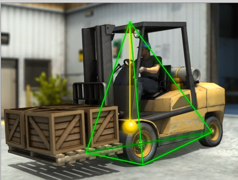
Image taken from course: Forklift Safety
Course library: Equipment Safety
Use Surprise and Good-Natured Humor
People like unexpected things and they like funny things (and, sometimes something is funny largely because it’s unexpected). This is why novelty and humor can be effective in training, though of course it’s important to use common sense and not use coarse humor or humor that will insult, alienate, shame, or offend others. But you knew that, no?
For example, the image below is a humorous representation of the H1N1 flu virus. The artist could have made a realistic interpretation of the virus, but in a course focused on the importance of things like hand washing and getting vaccinated, the humorous approach seemed more effective.

Image taken from course: H1N1 Flu Awareness
Course library: Health and Safety
And the image below puts an unexpected twist on safety icons (and the Jolly Roger–or is it the Jolly “Wrencher”?) to represent potential hazards while working on industrial machinery, perhaps grabbing the attention of a learner who’s just about to fade out at the simple thought of safety training.

Image taken from course: Equipment Maintenance and Reliability
Course library: Operations and Maintenance
And that wraps up our final section—of this article, at least. In this section, we covered the following techniques that allow you to “hijack” some natural desires of the brain to make your employees pay closer attention to their training and remember more, including:
- Appeal to their emotions
- Involve aspects of storytelling and narratives
- Make use of visual metaphors
- Use unexpected and humorous elements (but again, remember to be SFW)
Conclusion: Using Graphic Design to Improve Learning Results in Training Courses
Hope that helped! A million thanks to Connie Malamed on this, and we once again encourage you to check out her blog and buy and read her books.
If you’re still interested in learning more about graphics for learning, check out this article about matching the type of graphic with the type of learning you’re hoping to facilitate. In addition, this article on comic books and elearning is relevant, as is this this deep-dive look at Scott McCloud’s classic book Understanding Comics. And finally, this article about making training stick includes some tips on visuals.
Feel free to download the free guide below, too!

How to Write Learning Objectives
All the basics about writing learning objectives for training materials.
Sources
Want to learn more? Please consult the following resources for additional information about the concepts discussed above.
The Sample Training Visuals
The images in this article all come from e-learning courses created by Convergence Training. Convergence produces e-learning courses for workforce training in the following course libraries:
- Driver Safety
- Equipment Safety
- First Aid Hazardous
- Materials Health & Safety
- Human Resources
- Mining Safety
- Operations & Maintenance
- Paper, Box, Tissue, and Corrugated
The Graphic Design Techniques Described Above
The wonderful book Visual Language for Designers by Connie Malamed is the source for the graphic design ideas listed in this paper. The book is highly recommended. At the time this article was published, Malamed was working on a new book even more directly related to training visuals—look for it in the future.
Creating Great Training Materials by Using Better Training Visuals
This is covered well in many sources. One suggested source is the book Building Expertise: Cognitive Methods for Training and Performance Improvement by Dr. Ruth Colvin Clark (see in particular pages 34-40). Dr. Clark covers this same topic very well in many of her other books as well. Also, Clark’s book Graphics for Learning covers this same ground in comprehensive detail.
Dual Coding Theory of Learning
Cognitive Psychology and its Implications by John R. Anderson
Cognitive Theory of Multimedia Learning
Multimedia Learning by Richard Mayer
The quotes are useful and informative one.
Request to send me the same my mail also to keep them as a record and compliance/sharing with my staff
S P Bunger
GM HSE
These tips are great thanks.
Glad you found something useful. Looks like you all are doing some good work over there–keep it up!
Great design Composition and stunning animation. Please let me know if there are more post like this. Thanks
Anderson, thanks for the kind words. I’m not sure if there are a lot of blog posts like this here at the Convergence Training blog, but if you go to our primary website, you’ll see tons of samples of the animations from our courses–https://www.convergencetraining.com/all-courses.aspx