
Not that long ago, we recommended the book “Design for How People Learn” by Julie Dirksen. Now we’ve got another book recommendation for you—Connie Malamed’s “Visual Language for Designers: Principles for Creating Graphics that People Understand.”
First, an admission. We’re HUGE Connie Malamed fans. She’s got a great instructional design blog and a second blog for visual design. She’s got a neat instructional design app. She’s pleasant, sociable, and informative in social media circles. And yes, she’s got a really great book, too.
This article is a general overview/review of Malamed’s book. To see the ideas in her book “put into action,” check out this article: 25 Graphic Design Tips for e-Learning.
Which brings us back to the book recommendation.
Convergence Training provides learning management systems and e-learning courses, primarily for industrial and manufacture ring companies. Contact us if you have questions.
And feel free to download any of the free guides below while you’re here:
- Guide to Effective Manufacturing Training
- Guide to Effective EHS Training
- Guide to Writing Learning Objectives
TALKIN’ INFORMATION DESIGN AND VISUALS FOR TRAINING MATERIALS
When people talk about information design, the first name to come up is often Edwin Tufte’s.
And that’s for good reason—he’s got a lot of smart things to say on the topic. If you want to learn more about Tufte and his ideas, you can check out his website, go to a conference where he’s presenting (I attended one recently), and read his books to find out more. (A little side-note here: while we do admire Tufte and his work and have learned a lot from him, we think his criticism of PowerPoint is off target or at least overly stated—check out this article by Tom Kuhlmann of the Articulate blog if you’re interested in that.)
But Malamed’s book is especially interesting because, unlike Tufte, she wrote it specifically for people creating visuals for conveying information, and that’s its real strength. Well, that plus her wealth of knowledge, the great images in the book that illustrate her points, and her clear, enjoyable writing style.
Here’s a quick rundown of the chapters and sections within her book. Of course, we recommend you pick up a copy of the book and read it for yourself.
GETTING GRAPHICS
A nice explanation of how humans process visual information. This section is really helpful not only for creating effective learning visuals, but for understanding how people learn, remember, and later apply information in general.
ORGANIZATION FOR PERCEPTION
In this chapter, she explains the value of:
- Features that pop out as a result of color, depth, or similar tricks of the trade.
- Texture segregation used to draw attention to one feature or another.
- Grouping to organize information and draw attention to specific groups.
Here’s an example of “using features that pop out.” This is taken from our Back Injury Prevention course.

For more examples of organizing for perception, check out our 25 Graphic Design Tips for e-Learning Courses article.
DIRECT THE EYES
Here she discusses the importance of:
- Position, including creating hierarchies and isolations.
- Emphasis, including unexpected visual deconstructions, color contrasts, and unusual juxtapositions.
- Movement, including use of 3D perspective to direct the eye’s gaze, the use of “flows” and curves to guide the eyes through sequential information, and using shapes and lines to create visual rhythms.
- Eye gaze, in which the artist takes advantage of the viewer’s tendency to look at eyes in the image or to look in the same direct that people in the image are looking.
- Visual cues, including the use of circles, highlights, dashed lines, grids, numbered sequences, arrows, and pointers.
- Color cues, including the use of color to draw attention to specific parts of an image and/or convey information.
Here’s an example of “using movement or a sense of motion” to direct the learner’s eyes. This is a sample from our Pump Basics course. although the arrows DO create a sense of motion here, it’s worth noting that the course is actually animated and this is just a still image from that course, so there’s even more sense of motion in the real thing.

For more examples of visuals that direct the eyes of the learner, check out our 25 Graphic Design Tips for e-Learning Courses article.
REDUCE REALISM
This chapter includes discussions of:
- Visual noise, in which she discusses the importance of simplifying images to reduce visual distractions.
- Silhouettes, which introduces the impressive abilities of a silhouette to draw attention.
- Iconic forms, which covers the ability of icons to act as symbolic, readily understood, expressive sources of information.
- Line art, used to convey information in simplified form.
- Quantity, which explains how a smaller number of items can be used to express a larger number and how visual elements can be reduced in number to focus attention.
Here’s an example of “reducing the number of things in a visual” to reduce realism. This is a sample from our Overhead Crane Basics course.

For more examples of visuals that reduce realism to improve learning, check out our 25 Graphic Design Tips for e-Learning Courses article.
MAKE THE ABSTRACT CONCRETE
In this chapter, she discusses the importance of:
- Big-picture views, in which complicated processes are visually explained in “meta” overviews.
- Data displays, in which numerical (or other) data is expressed visually (Tufte would like this section).
- Visualization of information, in which non-numerical infmoration is expressed visually (things like online music listening history and the flight path of a bath).
- More than geography, which covers various uses of maps.
- Snapshots of time, in which various visual timeline methods are presented.
Here’s an example of creating a big-picture view to make the abstract more concrete. This is a sample from our Kraft Pulping Liquor Chemistry course.

For more examples of visuals that make the abstract more concrete, check out our 25 Graphic Design Tips for e-Learning Courses article.
CLARIFY COMPLEXITY
Here she presents the importance of making the complicated more simple, including:
- Segments and sequences, which discusses using visuals to break processes, procedures, and concepts into segments and sequences.
- Specialized views, which covers the power of microscopic views, expanded views, hidden interior views, exploded views, and more.
- Implied motion, which covers the use of implied motion of objects within static images.
- Inherent structure, which discusses the power of representing information within a symbolic or otherwise explanatory visual structure (such as discussing a genetics in a visual shaped like a double helix).
Here’s an example of using specialized views one couldn’t ordinarily see to clarify complexity (this “interior view” is a great advantage of 3D animations). This is a sample from our Centrifugal Cleaners course.

For more examples of visuals that clarify complexity, check out our 25 Graphic Design Tips for e-Learning Courses article.
CHARGE IT UP
Her final chapter presents these techniques for adding more to images:
- Emotional salience, which addresses the strong ability of emotional content to attract attention and the use of visual elements, such as color, to influence the viewer’s emotions.
- Narratives, which presents the importance of using visuals to tell stories (such as in procedures, sequences, chronologies, and such).
- Visual metaphors, which shows the effectiveness of using visual metaphors to further the explanatory power of a graphic (for example, an example graphic about the health hazards of unwashed vegetables in which a mushroom looks like a nuclear mushroom cloud).
- Novelty and humor, in which unexpected material and funny material is used to draw attention.
If you’d like to get a little more savvy about the way you use visuals in your training/learning materials, this book is a really great place to start. It’s a great resource for graphic designers, of course, but also for IDs and trainers who are part of the training-creation process.
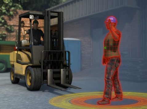
Here’s an example of using visual metaphors as a way to “charge up” the learner’s training experience. This is a sample from our Forklift Safety course.
For more examples of visuals that “charge up” the learner’s experience, check out our 25 Graphic Design Tips for e-Learning Courses article.
Conclusion: Effective Visuals for Training
We hope this post gave you a few useful tips for creating effective training visuals. Or even just gave you some tips to use when evaluating training materials made by others.
As we mentioned earlier, these examples are all drawn from the book Visual Language for Designers by Connie Malamed, our favorite ID blogger. If you’ve got time, do check it out. Also know that she’s get a second, newer book out on training visuals. We haven’t read that yet but have read great reviews.
If you have a particular interest in training visuals, you may also find our Match Your Training Visuals to Your Training Content article interesting. We’ve got a few more, similar articles in the works, so stay tuned.
Of course, we welcome your comments too. Let us know your thoughts or tips in the comments section below.
Last-minute bonus–while writing this blog post, we discovered this YouTube video featuring Malamed discussing visual design for learning.

great insight on learning.
Connie Malamed’s books are great. Check them both out and watch our blog for an interview with her soon.