In an earlier blog post, we took a quick introductory look at some connections between comic books and eLearning.
And in that article, we promised to follow up with a second article that focuses on the classic book Understanding Comics: The Invisible Art by Scott McCloud. And we also promised that the second article would focus on some lessons from comic book design that we can apply to the design of eLearning other forms of learning.
This, my friend, is that second article.
Before we get going, let’s take a stop at the “credit where credit is due” department. Scott McCloud’s book Understanding Comics: The Invisible Art is a classic and is GREAT. If you’ve read it, you can vouch for me. Or maybe you’ve just heard of it and know it’s very well regarded.
If you haven’t heard of the book or read it yet, I highly recommend it. If you read it, you’ll learn a lot on a wide variety of topics. And even better, it’s written in the form of a comic book, so you’ll have a lot of fun while you’re reading, too.
But even though I suggest you check the book out and promise you’ll like it, you won’t have to read the book to begin drawing some lessons from it. Because that’s the whole point of this article. And of the comments section at the bottom, too–please share all your own ideas.
- Learning Management Systems
- Online Workforce Training Courses
- Custom Workforce Training
- Incident Management Software
- Mobile Training Apps
McCloud’s book is divided into nine chapters. We’ll present some of the key ideas from each chapter in the sections below.
Those chapters cover, in order:
- A definition of comics (which can be applied to eLearning courses too)
- The power of simplification
- The viewer’s role in creating meaning
- Time and representations of time
- Making appeals to emotions
- Combining words and visuals
- The process of design and development
- The use of color
- A summary
Ready? Here we go.
Chapter 1: Setting the Record Straight
McCloud starts his book by trying to define what the word “comics” means.
He begins with an earlier definition put forth by Will Eisner (an earlier, also-famous writer of and about comics). That definition was “sequential art,” which means, of course, art in an order.
From there, McCloud tweaks and modifies that earlier definition over a series of pages, winding up with his own definition:
“Juxtaposed pictorial and other images in deliberate sequence, intended to convey information and/or to produce an aesthetic response in the viewer.”
That includes some big words used in pretty specific ways, so let’s break it down a bit. We’ll see how the definition applies to comic books but also how it can relate to eLearning as well.
Let’s begin by looking at the definition again, highlighting and then discussing different parts as we go.
“Juxtaposed pictorial and other images in deliberate sequence, intended to convey information and/or to produce an aesthetic response in the viewer.”
Juxtaposed means being placed adjacent or side-by-side. This applies to comic books, which often have several panes located side-by-side on a single page, and images on one page that are side-by-side with images on another page, with all those pages being presented in a series.
This also applies to eLearning courses, which typically have a series of images within one screen (so they’re juxtaposed by time) and a series of screens that the learner progresses through by clicking a NEXT button (again, so they’re juxtaposed in time). In addition, it’s becoming increasingly common for eLearning courses to present multiple images on screen at the same time, following the multiple-panes-on-one-page visual style of comic books.
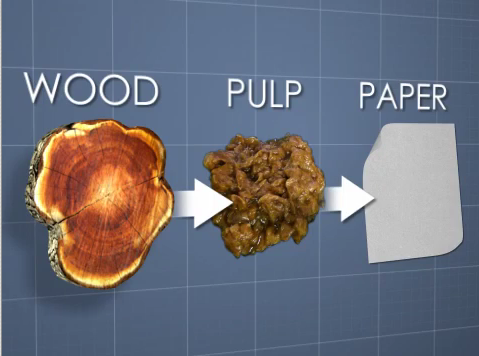
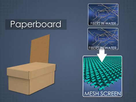
Here’s an example of juxtaposed images in one screen from an eLearning course about papermaking processes:
Now let’s return to the definition and look at another part.
“Juxtaposed pictorial and other images in deliberate sequence, intended to convey information and/or to produce an aesthetic response in the viewer.”
In comic books, McCloud is talking about pictures, written words, and other images within each pane.
Likewise, eLearning courses also often include pictures, written words, icons, symbols, and other images.
Here’s an example of a photorealistic animation from an eLearning course on tanker rollover.

And here’s another example of icons or symbols used in an safety eLearning course on Hazard Communication.
![]()
We’ll move on to the next part of the definition again.
“Juxtaposed pictorial and other images in deliberate sequence, intended to convey information and/or to produce an aesthetic response in the viewer.”
The typical comic book is written to be read in a linear, start-to-finish. I think that’s changed a little bit with comic books presented in eBook format, but it’s still standard.
Likewise, eLearning courses are often presented in a sequence. In some cases, the learner progresses in a linear fashion. Of course, that’s changed a bit, as learning designers have become increasingly aware of the value of letting the learner choose his/her own navigation. But even given that, the idea of sequence is still important in eLearning as well. We sequence materials within a “chunk” to improve learning. And we sometimes sequence the chunks, while other times allowing employees to pick their own sequence and/or work through scenario-based branching exercises.
Here’s an example: a short video sample from an eLearning course that presents visuals in a deliberate sequence (this is from a mining safety course).
And now a new part of the definition:
“Juxtaposed pictorial and other images in deliberate sequence, intended to convey information and/or to produce an aesthetic response in the viewer.”
Comics convey information–typically a story.
Likewise, eLearning courses are intended to convey information–typically to help employees develop a skill or comply with a business requirement or regulation.
Here’s a simple example of a screen from an eLearning course intended to explain a papermaking process–we see juxtaposed pictorial images intended to convey information.
Yet another part of the definition:
We’ll move on to the next part of the definition again.
“Juxtaposed pictorial and other images in deliberate sequence, intended to convey information and/or to produce an aesthetic response in the viewer.”
Readers of comic books experience a wide variety of emotions and responses as they read, all of which can be grouped under the umbrella phrase “aesthetic response” here.
Likewise, learning experts have shown that training materials that elicit emotional and aesthetic responses prove more memorable.
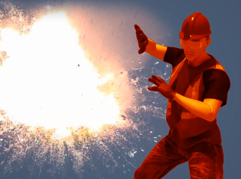
Here’s an example from an eLearning course on arc flash and electrical safety.
And now, the final part of the definition–and probably the most important one at that:
“Juxtaposed pictorial and other images in deliberate sequence, intended to convey information and/or to produce an aesthetic response in the viewer.”
McCloud’s definition acknowledges the importance of the comic book reader and of designing comics with the reader in mind. And as you’ll see in this article, McCloud thinks the comic book reader plays a large, arguably central, role in creating the meaning of a comic. And he thinks one of the strengths of a good comic is that it’s a medium that relies heavily on the reader to create the experience and meaning.
Likewise, eLearning experts also acknowledge the importance of designing learning materials for the reader and of creating learning activities that allow and call on the learner to be an active part of the learning experience.
Bonus reads: The following articles all touch on the central role of the learner in the learning experience and in creating meaning during training:
- Task Analysis
- Adult Learning Principles
- How People Learn
- Julie Dirksen’s Design for How People Learn
- Scenario-Based Learning
- Training that Works: Six Tips from Made to Stick
Review of the Definition and Lessons
So, to review, we know that McCloud’s definition of comics is: “Juxtaposed pictorial and other images in deliberate sequence, intended to convey information and/or to produce an aesthetic response in the viewer.” And we’ve now learned what all that means and seen how that can apply to eLearning courses as well.
Chapter 2: The Vocabulary of Comics
The second chapter focuses on the two primary components of comic books–the written word and the images. And most especially, on the images.
One of the key points that McCloud makes here is that comics often, though not always, involve visuals that present the world in a simplified manner.
For example, he discusses at length simple visuals like the one below that comic book readers immediately interpret as a human face.

McCloud believes that the simplicity of comic book visuals gives the visuals more power, largely because they call upon the comic book reader to help create the meaning. To get his point, look at that image above again, which I made in PowerPoint by creating three circles and a straight line. To borrow an argument McCloud makes, not only can you see that image and recognize it as a face, it’s almost impossible to not see a face in that image–despite how simple it is.
Now let’s consider eLearning. Training developers are also aware that simplifying visuals can lead to increased learning. And that’s true for at least two reasons: first, because visuals can be simplified to remove distractions, and because simplified images also actively involve in the learner’s brain in creating meaning (which makes the material more memorable).
For example, even though we at Convergence can make training materials with amazingly realistic and life-like representations of complex machinery (and often do), we also often use visuals that are very simplified by doing things like removing backgrounds.
Here’s an example of a simplified representation of a valve, from a manufacturing eLearning course on valves. Not the lack of a background and the simple representation of the fluid or gas running through the pipe and valve.

And here’s another example from an eLearning course on papermaking. Note the simplified representations of the machine and the paper being “doctored.”
Just as McCloud notes that comic books often include simplified visuals (but sometimes include more complex visuals), he says the same basic thing about the writing in comic books. While it can be and sometimes is complex, it’s often simple and that simplicity brings a lot of power with it. We’re focusing on visuals in this blog post and so we won’t go into great detail about writing, but writing simply is one of the tips we provide in our Writing Training Materials post.
Bonus read: Our 25 Graphic Design Tips for eLearning includes an entire section on visual simplification.
Chapter 3: Blood in the Gutter
Before I get into the lessons from this chapter, let me explain that the word “gutter” is a technical term used to refer to the blank space between the boxes or panes within comic books.
McCloud believes a lot of the meaning comes from those blank spaces. As he puts it:
“And despite its unceremonious title, the gutter plays host to much of the magic and mystery that are at the very heart of comics.”
Further, McCloud introduces another term to explain why gutters are magical: closure. McCloud defines closure as the:
“…phenomenon of observing the parts but perceiving the whole.”
By this, he means the process of looking at a series of visual images (and words) within panes on printed paper and giving life to, creating, and being absorbed into, a narrative.
Moreover, McCloud believes that comics, largely due to the way they present still visuals within panes to represent reality, are:
“A medium where the audience is a willing and conscious collaborator and closure is the agent of change, time, and motion.”
Or, to put that into more everyday-speak, when a reader is presented with a series of panes in a comic book, the reader willingly and knowingly works together with the comic book creator to create the experience by using closure to represent change, time, and motion where they don’t really exist. The reader brings them into existence.
This is easy enough to understand in comic books.
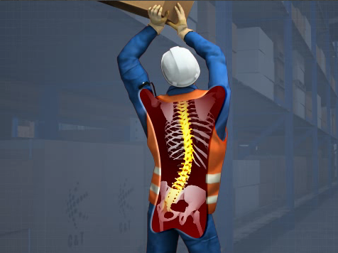
And it’s also easy enough to understand in eLearning. Consider the image below from an eLearning course on back injury prevention as a simple example (ignore that this is one image and not three images without “gutters” between them–this image still works on the same principle of closure).
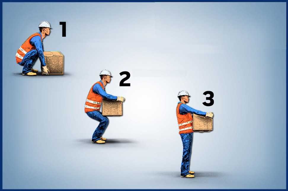
There’s no real change, passage of time, or motion in this image. To test that, look at it, look away for five seconds, and then look back. Go ahead, we’ll wait. See? Everything’s exactly the same. But when you look at this image, with its three different depictions of a man and a box, your mind collaborates with the graphic designer to fill in the gaps and to create change, the passage of time, and motion.
Let’s see how that works. The man bends down, grabs a box, and lifts it. All while doing so in a manner that protects his back. The box moves from the ground (which doesn’t exist either) to a spot about three feet higher. And this happens over several seconds, with the passage of time being represented by the movement of the eyes from left to right.
But you created all that. None of it really happened, and none of it is even directly represented in the image. And because you created it, there’s a greater chance that you’ll remember this and that you’ll follow safe lifting practices the next time you have to lift something.
This is very much in fitting with the theories about how people learn and create meaning through the active participation of their own brain. One of the keys of adult learning principles is to make learning an active learning experience. Presenting visual information this way in an eLearning course makes the learner an active participant in the learning process–in fact, it’s the learner that creates the learning experience.
Bonus read: Check Julie Dirksen’s book Design for How People Learn for more about how the learner creates the learning that happens on the job and during training.
Chapter 4: Time Frames
In the next chapter, McCloud focuses on issues related to time and the passage of time in comic books.
There’s a lot of interesting stuff here, much of which relates to using devices to simulate the passage of time.
And you can see how useful that is in eLearning, because we know that people can only hold information in their working memory for about 15 seconds, and after that, it’s either stored in long-term memory or it’s lost.
Bonus reading: Read more about how information “moves” through various phases of memory here and here.
For an example of the representation of time in an eLearning course, consider this image from an eLearning course on papermaking. The curved line and arrow, a simple visual convention used to represent motion through time, helps to explain the path of a sheet of paper through papermaking machinery.

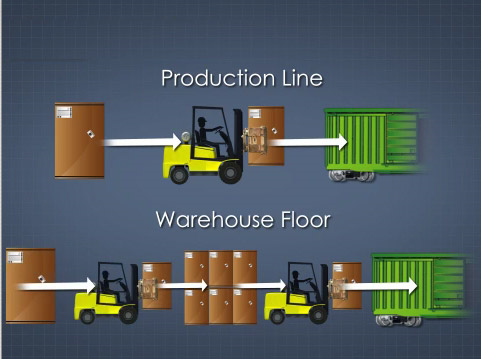
For another simple example of how an image can “compress” time this way, consider the image below from a course on railcar loading.
This simple visual treatment demonstrates what would take minutes to demonstrate in real life into only a few seconds. And that matters when people have such a limited amount of time during which they can remember information.
Of course, eLearning courses occur in the form of videos, so they represent time as a video advances as well. In the example below, from an industrial course on palletizing, you can see a quick overview of the multiple steps of a packaging process illustrated in just a few seconds.
Animations like the one you just saw can also be used to represent time in slow-motion or speeded up. Check back in the future, we’ve got some examples of that and I’ll either pop those into this blog post here (once I scare them up) or write about them in a separate blog post.
Chapter 5: Living in Line
In this chapter, McCloud addresses the ability of comics to elicit an emotional response in readers.
By creating emotional responses, comics become more engaging, thrilling, and compelling.
Obviously, eLearning courses can benefit from some of that (being engaging, thrilling, and compelling). Plus there’s evidence that people remember things more if emotions are involved.
There are lots of ways that training materials can be designed to elicit emotional responses from learners. Some are pretty overt, others are more subtle. We’ve included a few examples below.
Here’s an image from a safety training eLearning course that uses the red-colored background to represent potential dangers and to elicit a subtle emotional response in the viewer.

This threatening image of a tornado from a course on Emergency Action Plans is enough to make the leaner feel a little and realize this could one day be real.

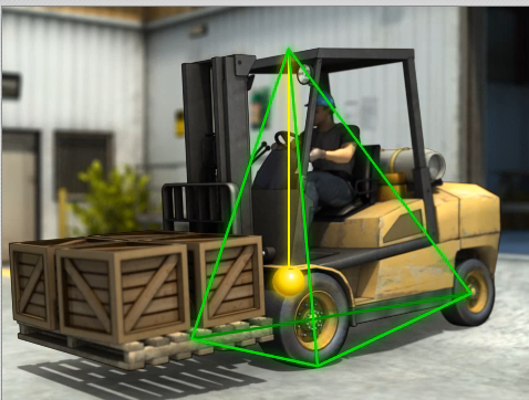
This accident scene from a forklift safety course helps capture (and share) the emotions that can arise during a forklift accident.

This image makes an unexpected and humorous use of the Jolly Roger to draw the viewer’s emotions and attention to a discussion of workplace safety.

And this image uses a mix of fear and humor in workplace safety training.
Can you think of ways you’ve tried to create an emotional reaction in learners?
Bonus read: The book Made to Stick includes some good stuff on the use of emotions, including surprise, as well.
Chapter 6: Show and Tell
In the chapter called Show and Tell, McCloud takes a closer look at how comics blend both pictures and words to great effect.
The parallels are obvious here, because eLearning courses also use images and words. Check the short sample from an eLearning course about operating overhead cranes as an example.
To quote McCloud:
“In comics at its best, words and pictures are like partners in a dance and each one takes turns leading. When both partners try to lead, the competition can subvert the overall goals…though a little playful competition can sometimes product enjoyable results. But when these partners each know their roles–and support each other’s strengths–comics can match any of the art forms it draws so much of its strength from.” (Source: Understanding Comics: The Invisible Art, Scott McCloud, p. 156)
He goes further to list and give examples of specific ways that comics can blend words and pictures together. We won’t go into these in detail here, but here’s a quick list (this list is drawn from Understanding Comics, pp. 153-155):
- Picture-specific combinations: “words do little more than add a soundtrack to a visually told sequence.”
- Due-specific combinations: “both words and pictures send essentially the same message.”
- Additive combinations: “where words amplify or elaborate on an image or vice versa.”
- Parallel combinations: in which “words and pictures seem to follow very different courses–without intersecting.”
- Montage combinations: “where words are treated as integral parts of the picture.”
- Interdependent combinations: “where words and pictures go hand in hand to convey an idea that neither could convey alone.”
We invite you to read the book to give this more thought and see examples of each that McCloud has created.
This same concept–that words and pictures can be blended effectively–is true for eLearning courses, too. And it’s probably true that each of the six styles of picture/word combinations listed by McCloud (and shown directly above) can be used effectively at specific times within an eLearning course.
Probably the best place to start thinking about how to effectively blend words (both spoken and written on screen) and is to become familiar with the Dual-Coding Theory, Mayer’s Multimedia Principle, and Mayer’s Cognitive Theory of Multimedia Learning.
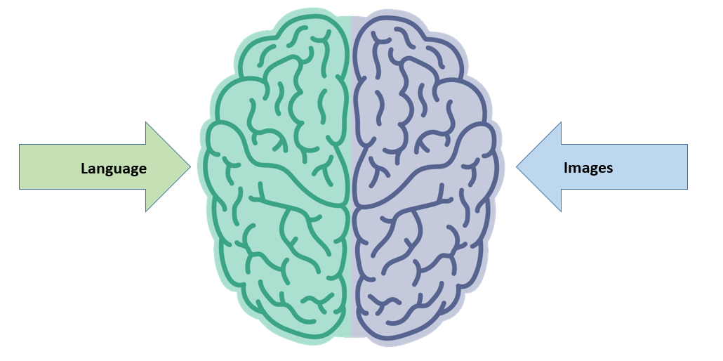
Briefly, the Dual-Coding Theory states that our brain processes information in the forms of words (spoken or written) and pictures through two separate, independent “processing channels.” (Please note this is not the right brain/left brain argument, and the two-colored drawing of a brain below is not intended to represent that idea.)
Here’s how they explain this at the Education.com website we linked to a few paragraphs up:
“The theory assumes that cognition involves the activity of two qualitatively different mental codes, a verbal code specialized for dealing with language in all its forms and a nonverbal code specialized for dealing with nonlinguistic objects and events in the form of mental images. These coding systems are separate but interconnected so that they can operate independently, in parallel, or through their interconnections. The linguistic, or verbal, code dominates in some tasks, the nonverbal code dominates in others, and both systems are frequently used together.” (Source: Education.com)
Taking the Dual-Coding Theory as a starting point, we can then move on to consider the main points of Mayer’s Multimedia Principle, which states:
“People learn better from words and pictures than from words alone.” (Source: Multimedia Learning, Richard E. Mayer, 2nd Edition, p 1)
So that’s short and sweet. People learn better when words and pictures are combined. Here’s another example, from a course on gears for industrial maintenance.
But that doesn’t mean you can combine words and pictures in just any way. Just as McCloud pointed out that there are different ways to combine words and pictures in comic books, and that those different combinations have different end results, and are used more or less effectively be considering the intended final result, the same is true in eLearning. You can combine words and pictures poorly, and create eLearning courses that don’t add to learning or even decrease learning. Or you can combine words and pictures effectively, and create eLearning courses that increase learning.
With this in mind, we can take some important first steps by understanding Mayer’s Cognitive Theory of Multimedia Learning. It states:
- We process information through two separate channels (auditory and visual)–we covered this already in discussing the dual-coding theory
- There’s a limit to the amount of information either of those two channels can process at any one time–we risk creating cognitive overload if we overwhelm either channel with too much information.
- People learn by beginning with prior knowledge and then actively filtering, selecting, organizing, and integration new information with that prior knowledge
Let’s show you just a few techniques below that you can very easily use.
The image immediately below, taken from a course on back injury prevention, is a good example of using a colored highlight in sync with audio to draw the learner’s attention to what the audio is talking about–the spine, in this case.
Here’s a similar use of highlighting, in sync with audio in a course on paper manufacturing.

Another technique involves labeling items on screen. When you do choose to label items on screen, try to use short labels and try to put the label very close to the item it describes or names. This image from a course on paper manufacturing is a good example.

There’s a lot more to be said about this. Watch for additional blog posts from us highlight more of these techniques, scroll back up and check out those books and online articles we recommended just a little bit ago, or, if you’ve got about 90 minutes, check out the video below, or check some of the links we’ve provided below that.
There’s a LOT more information out there to help you create eLearning courses that effectively combine words and visuals to improve learning results. Here are a few resources to check out:
- Our own article 25 Graphic Design Tips for eLearning Designers
- The book Visual Language for Designers by Connie Malamed
(You can also read our write-up about this book here) - The book Visual Design Solutions: Principles and Creative Inspiration for Learning Professionals by Connie Malamed
- Our own article on Matching Training Graphics to Training Content
- The book Graphics for Learning by Ruth Colvin Clark & Chopeta Lyons
- The book Multimedia Learning by Richard E. Meyer
- The book eLearning and the Science of Instruction by Ruth Colvin Clark and Richard E. Mayer
And hey, don’t forget to use the comments field below to add your own ideas.
Chapter 7: The Six Steps
In this chapter, McCloud highlights how comics are like other forms of communication. Kind of like how we’re showing that comics and eLearning can have a lot of similar characteristics.
He begins by claiming that any human activity not directly associated with survival or reproduction is a form of art. This includes creating and consuming comic books and eLearning courses (although both could, in theory, contribute to survival and reproduction as well).
He then says that the creation of any work, in any medium (including comics and eLearning courses), “will always follow a certain path.” (Source: Understanding Comics, p. 169). That path is made up of the “six steps” this chapter is named for, and those six steps are as listed below (source: Understanding Comics, pp. 170-171).
- Idea/purpose: “The impulses, the ideas, the emotions, the philosophies, the purposes of the work…the work’s content.”
- Form: “The form it will take. Will it be a book? A chalk drawing? A chair? A song? A sculpture? A pot holder? A comic book?”
- Idiom: “The “school” of art, the vocabulary of styles or gestures or subject matter, the genre that the work belongs to…maybe a genre of its own.”
- Structure: “Putting it all together…what to include, what to leave out, how to arrange, how to compose the work.”
- Craft: “Constructing the work, applying skills, practical knowledge, invention, problem-solving, getting the job done.”
- Surface: “Production values, finishing.. the aspects most apparent on the first superficial exposure to the work.”
Now that we’ve seen this list, and seen McCloud’s explanation of each step, let’s see how they might relate to the creation of eLearning (or training materials in general).
- Idea/purpose: Typically, in training, this would be the need to train someone. Which typically means the need to fill a skill or knowledge gap.
- Form: We’re talking about eLearning courses in this article, but of course there are other “forms” that training can take as well. Maybe an OJT field-based mentorship; maybe some classroom-style instructor-led training; maybe an eLearning course; maybe a video or live webinar; maybe a podcast. Or maybe you won’t create training at all, but a job aid instead.
- Idiom: Assume you’re creating an eLearning course, what kind of eLearning course will it be? A linear course driven by next buttons? A scenario-based eLearning course? One that relies on a story? An entirely self-guided course? You should choose the option that best fits the learning need.
- Structure: This pretty closely maps to what instructional designers typically call the “design” phase of ADDIE. Read more about design here, download our free guide to effective safety or manufacturing training (both of which include sections on design), or check out Julie Dirksen’s great book Design for How People Learn (as of this date, our review covers her version 1, and she’s now released a new version–we’ll try to update that article soon).
- Craft: This pretty closely maps to what instructional designers call the “develop” phase of ADDIE. Roll up your sleeves and get it done.
- Surface: This can include a lot of things–being careful to review your material for errors, marketing your materials, and (quite importantly) making sure you’ve got a simple, intuitive user-interface.
Chapter 8: A Word About Color
Most of Understanding Comics is in black-and-white. Exceptions include the cover (you can see a picture of the cover at the top of this article) and a seven-page sequence in this chapter, which (obviously) focuses on color.
Although most of the chapters in this book include lessons that can be applied to many forms of visual communication, large sections of this chapter are pretty exclusive to comic production, including financial constraints that led to comics using a flat color palette or relying on black and white line drawings.
However, McCloud does note that color can add a powerful, expressive, communicative, almost magical quality. As he says:
“In black and white, the ideas behind the art are communicated more directly. Meaning transcends form. Art approaches language. In flat colors, forms themselves take on more significance. The world becomes a playground of shapes and space. And through more expressive colors, comics can become an intoxicating environment of sensations that only color can give. The surface qualities of color will continue to attract readers more easily than black and white, and the story of color will not doubt continue to be intertwined with the forces of commerce and technology. We live in a world of colors, not just black and white. Color comics will always seem more “real” at first glance….One thing’s for sure, though. When used well, color in comics can–like comics itself–amount to farm more than the sum of its parts.” (Source: Understanding Comics, p. 192)
I’m not a visual artist, and I’m no expert in color theory, so I won’t go to great lengths to explain how to use color effectively. Thankfully, we’ve got an entire department of wildly creative, highly knowledgeable and skilled graphic designers here at Convergence Training, so I am rarely left in charge of a color decision. But if you want to learn more about this, here are some helpful resources:
- Online color theory resources (looks comprehensive)
- Color theory for designers
- Our own article 25 Graphic Design Tips for eLearning Designers (includes a section on color use)
- The book Visual Language for Designers by Connie Malamed (includes materials on color)
- The book Visual Design Solutions: Principles and Creative Inspiration for Learning Professionals by Connie Malamed
- The book Graphics for Learning by Ruth Colvin Clark & Chopeta Lyons
- Our own Graphics for eLearning article based on the Clark & Lyons book above
And below we’ve got a few effective uses of color in training materials, drawn from Convergence Training eLearning courses.
This image from a course on slings and rigging shows an effective use of color for highlighting.

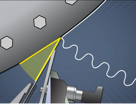
This still image from a course on trenching and excavation uses colors to represent opposing physical forces.

This image from a course on forklift operation uses color to help explain an abstract concept of stability.
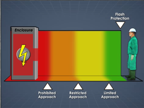
Here’s a similar use of color from a course on arc flash safety that represents different levels of danger at different distances.
This image from a papermaking course uses color effectively to show different parts of the cardboard core at the center of a paper towel.
And this image from a course about valves shows an effective use of color in displaying information graphically.
Finally, because McCloud mentions the fact that we live in a world of color and that using color can make graphics look more “real,” and because sometimes looking “real” is just what’s needed in training, here’s an example from a mining safety eLearning course that uses color effectively to create a realistic representation of a worksite and work equipment.

And here’s another example of realism, which both grabs the attention and helps with identification, from a First Aid for Snake Bites eLearning course.

We could go on, but you get the idea.
In fact, if you feel like it, check out this short highlight video to look for examples of the use of color.
Bonus read: For more examples, check out our 25 Graphic Design Tips for eLearning article.
Chapter 9: Putting It All Together
In his final chapter, McCloud “wraps it all up.”
We won’t go into detail about the final chapter here, instead encouraging you to buy the book, read it for yourself, give it some thought on its own level, and then giving it some thought again to see how you can apply what he’s saying to eLearning creation.
But we will cherry-pick a few quotes from the chapter to give you an idea of what he’s saying. We’ve chosen the quotes largely because we think they directly relate to comics and other forms of communication, including of course our topic du jour, eLearning. We’re going to identify the page numbers each quote is drawn from in parentheses–such as (p. x).
“All media of communication are a by-product of our sad inability to communicate directly from mind to mind (p. 194)…
Sad, of course, because nearly all problems in human history stem from that inability. Each medium (the word comes from the Latin word meaning middle) serves as a bridge between minds. Media convert thoughts into forms that can traverse the physical world and be re-converted by one or more sesnese back into thoughts. In comics, the conversion follows a path from mind to hand to paper to eye to mind. Ideally the artist’s “message” will run this gauntlet without being affected by it, but in practice this is rarely the case (p.195)….
The mastery of one’s medium is the degree to which that percentage can be increased, the degree to which the artist’s ideas survive the journey (p. 196)…
And communication is only effective when we understand the forms tha tcommunication can take (p 198)…”
To apply a little of that more directly to eLearning creation, just consider:
- eLearning creation is an attempt to communicate information
- The learner plays a central role in the creation of meaning and in learning
- An effective instructional designer is one that recognizes the central role of the learner and who designs materials that are inline with the way people learn
- The more we learn about instructional design, and the communication media is uses, the more effectively we can aid people in learning
Sound about right?
Conclusion: Lessons on Visual Communication from Comic Books for eLearning Design
Hope you enjoyed the article and maybe learned a thing or two. Or at least glanced your eyes over something to get you thinking.
And of course, we hope that if you haven’t read McCloud’s book yet, that you hightail it down to your local bookstore and do just that.
Finally, we also hope you share your own thoughts, opinions, and experiences. Please use the comments section below if you’ve got a minute.
And don’t forget to download your free guide below, too.

Manufacturing Training from Scratch: A Guide
Create a more effective manufacturing training program by following these best practices with our free step-by-step guide.
Hi Jeff:
May I have permission to link to your article on my own site? I found it fun and different than many eLearning articles.
I own a start-up, Instructional Design Genius, which specializes in project management and learning theory. It looks like our respective offerings differ enough that I don’t have any problem sending folks to this page when they click the link I would post.
By the way, I used to work for the largest industrial packaging manufacturer in the world, Greif Inc. If you don’t already do business with them you guys should look them up.
Best,
Chris
Chris, absolutely, feel free to link to it.
Best of luck to you in your business. We hope you do well.
I’ve responded via email to the rest of this. Have a nice day.
Hi Jeff,
I’ve said it on your twitter and I’ll say it now, great article. It was interesting that you mentioned Will Eisner in your post. Something he wrote in his own book, Comics and Sequential Art, seemed relevant here. Eisner mentions that comics function on the basis that everyone that’s reading it and the person that has written it have shared common experiences. I wonder how you think that’s true and if it applies to instructional training. Are the most engaging instructional materials written by people who have been in the field, or is an emotionally driven narrative just as good? I’d like to know what you think.
Hi, Ben,
Hope you’re well; thanks for the comment/question.
As for “who writes the most engaging instructional materials,” I don’t think it’s necessary to have knowledge based on working in the field, although I think that’s important. And I don’t think having knowledge based in field work guarantees you’ll be a good instructor, either (though it can certainly help).
What I DO think is necessary for good instruction is a set of “basic” instructional techniques. This can include the “emotionally driven narrative” you mentioned.
For sure, though, I think that the field-based knowledge can really help.